Browsing
The copper.org web site uses Responsive Design techniques to optimize browsing on different devices including smart phones, tablets and desktops.
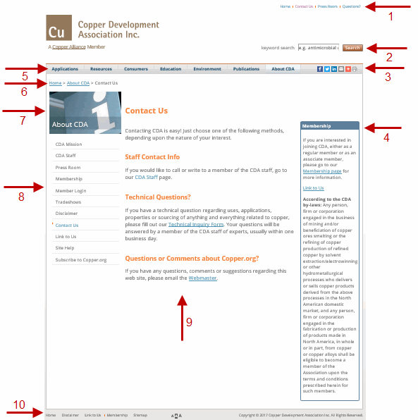
Below is a snapshot of a standard Copper.org web page on a wide device such as a laptop or desktop with major parts highlighted and explained.

- Header Links - the fastest way to Home and Questions? (online request form); the only way to access About CDA, Contact Us, Press Room pages.
- Search Box - enables you to search Copper.org from any page by entering keywords.
- Utilities Bar - enables you to print
 , email
  and share
 almost any page and also, to adjust the font size
  .
. - Right Content Boxes - contains supporting info for the main content, i.e. Downloadable Resources, Events, Helpful Hints, Sub navigation, etc.
- Main Site Navigation - 3 level roll-over menu provides fast access to major sections/subsections of Copper.org. Also, highlights the user's current position.
- Section Image/Title - identifies a major section, i.e. About CDA, Publications, etc. Pages within one section share the same Section Image/Title.
- Section Navigation - supplements Main Site Navigation by providing up to 2 additional levels of access to pages within major subsections. Also, highlights the user's current position.
- Main Content Area - contains main content for the page.
- Footer Links - the fastest way to Home, Disclaimer, Link to Us, Membership and Sitemap pages.
Browsing on a Smart Phone

The following is a snapshot of a standard Copper.org web page on a typical mobile device such as an iPhone or Android phone with major parts highlighted and explained. It is very similar to above but with slight changed noted below.
- Header Links - the fastest way to Home and Questions? (online request form); the only way to access About CDA, Contact Us, Press Room pages.
- Search Box - enables you to search Copper.org from any page by entering keywords.
- Utilities Bar Currently, the utilities bar is not enabled on mobile versions of the website.
- Related Info Content Boxes - On the mobile versions of the website, this is located after the primary content and they contain supporting info for the main content, i.e. Downloadable Resources, Events, Helpful Hints, Sub navigation, etc.
- Main Site Navigation - On mobile, this is a drop-down (the design is native to each particular device OS) and provides fast access to the major sections/subsections of Copper.org.
- Breadcrumbs - Identifies the navigation path the particular page is located within the content hierarchy of the Copper.org website.
- Section Image/Title - identifies a major section, i.e. About CDA, Publications, etc. Pages within one section share the same Section Image/Title.
- Section Navigation - supplements Main Site Navigation by providing up to 2 additional levels of access to pages within major subsections. Also, highlights the user's current position.
- Main Content Area - contains main content for the page.
- Footer Links - the fastest way to Home, Disclaimer, Link to Us, Membership and Sitemap pages.
Contacting Us
To contact CDA, choose one of the following methods, depending upon the nature of your interest. For Technical inquiries, submit a Questions? form.
Becoming a Member
If you are interested in becoming a member of CDA, learn more about our Membership.
Joining Our Suppliers' Databases
If you are a supplier, installer or contractor who manufactures, sells or works with copper materials or products, you may be eligible to be included in one of our Supplier Databases. These resources help hundreds of customers to locate companies to supply products or services to meet their needs. If you are interested in being listed on one of our supplier directories, please contact us by phone or web.
Using This Site
Please read our Disclaimer regarding use of the information on this site.
